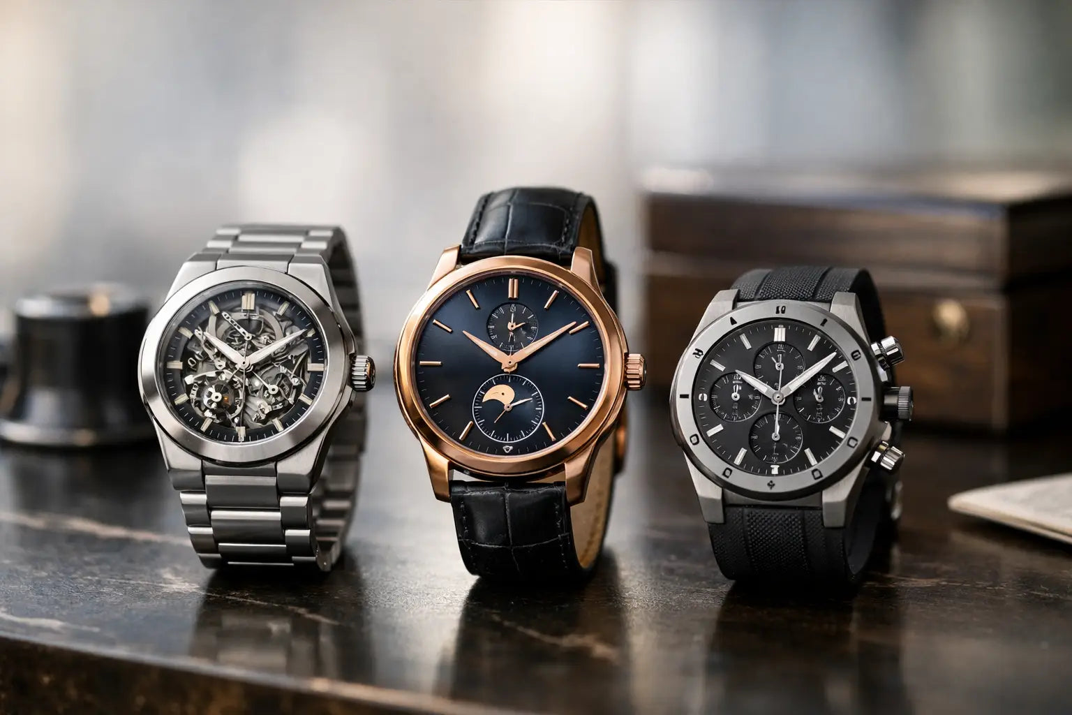
Article: Integrated Bracelet Watches: Why They Wear Differently
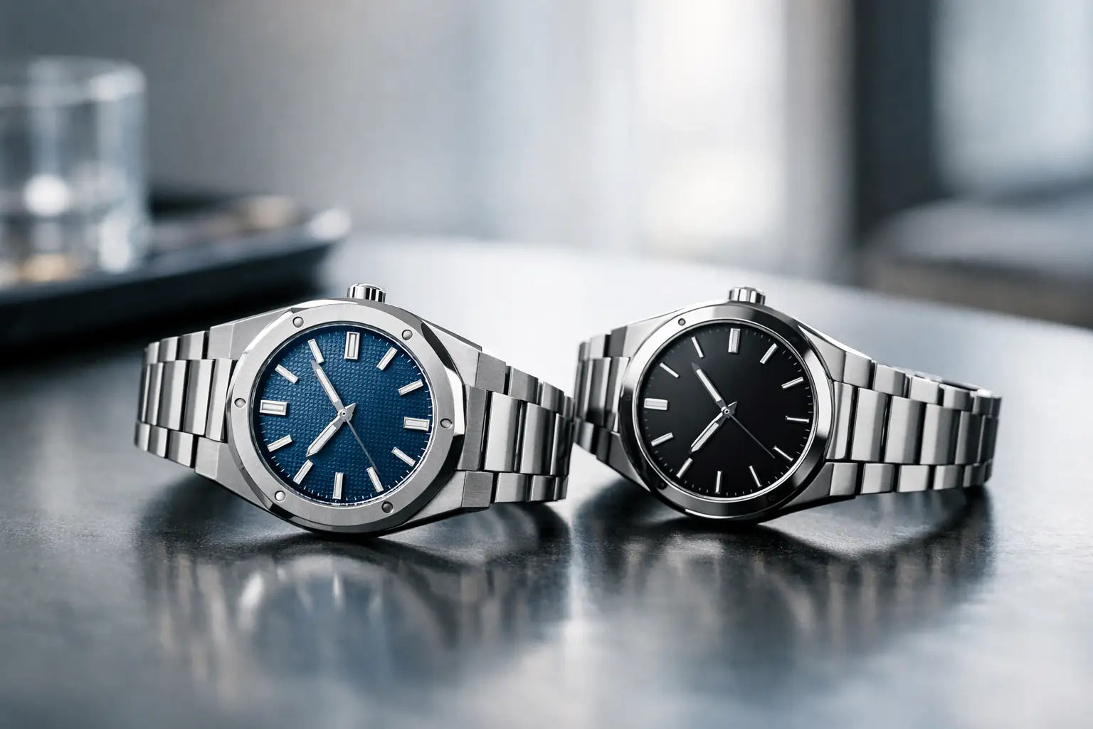
Integrated Bracelet Watches: Why They Wear Differently
A watch can have a famous dial, a complicated movement and a heavy price tag, then still disappear on the wrist if the case and bracelet do not speak the same language. Integrated bracelet watches avoid that problem completely. Their bracelet begins at the case rather than hanging from conventional lugs, creating one continuous, deliberate silhouette. It is a design decision that changes everything: wrist presence, comfort, proportions and the way light moves across the metal.
This is why the category has become the uniform of people who want their watch to look considered before anyone has even read the dial. The strongest examples are not trying to imitate jewellery. They are architectural objects in steel, titanium, gold or ceramic - built around geometry, surface finishing and control.
What makes integrated bracelet watches different?
On a conventional watch, the case ends at a pair of lugs and a strap or bracelet is attached between them. That separation is practical. It allows easy changes between leather, rubber, nylon and metal, and it gives the wearer more freedom to alter the character of the watch.
An integrated design takes the opposite route. The first bracelet links are shaped specifically for that case. Their width, taper, angle and finish are all calculated as part of one composition. Remove the bracelet and the watch often loses a large part of its identity.
That is the point. A proper integrated bracelet watch has a visual flow that cannot be achieved by simply fitting a steel bracelet to a round case. The transition from case to wrist should feel intentional, with no awkward gap, no generic end link and no sudden change in scale.
The result is immediate authority. A slim, angular case appears wider and more substantial because the bracelet carries its horizontal lines across the wrist. A sports watch gains a sharper, more technical stance. Even at modest dimensions, it can look far more present than a conventional watch of the same diameter.
The design codes that create wrist presence
The best integrated designs are not defined by one shape. Some are octagonal and industrial. Others are rounded, cushion-shaped or softly squared. What they share is disciplined proportion.
The case-to-bracelet transition
Start here, because this is where a watch either looks engineered or merely styled. The end links should sit close to the case and follow its geometry. On a faceted design, a bracelet with flat planes and crisp edges makes sense. On a smoother case, rounded links can maintain the flow without looking disconnected.
A poor transition creates a visible break between case and bracelet. It makes the watch look top-heavy, especially from above. A strong transition makes the entire piece read as one object, which is the central appeal of the category.
Taper is not a minor detail
A bracelet that remains wide all the way to the clasp can feel aggressive and heavy. That can work on a large, deliberately muscular sports watch, but it often sacrifices comfort. A gradual taper gives the watch balance: strong at the case, controlled at the clasp.
For most wrists, taper also improves the fit. The visual mass sits where it should - around the case - rather than wrapping the whole wrist in the same width of steel. A bracelet can still have serious weight without feeling like a cuff.
Finishing creates the contrast
Integrated bracelet watches live or die by finishing. Brushed planes keep a sports watch purposeful. Polished bevels and centre links introduce flashes of light and make the case geometry more visible. The most satisfying executions use both, not indiscriminately, but where the design needs definition.
This is also why everyday wear matters. Highly polished surfaces look exceptional under shop lighting, but they show marks quickly. A predominantly brushed bracelet is usually the better choice for frequent use, while polished accents deliver enough visual impact without turning every hairline scratch into a distraction.
Fit matters more than the stated size
A common mistake is choosing by case diameter alone. With integrated bracelet watches, the effective footprint is often much larger than the number on the specification sheet suggests. The fixed first links extend the watch across the wrist, so a 39 mm case may wear more like a conventional 41 mm model.
Measure your wrist, but also consider its shape. A flatter, broader wrist can carry a more angular case and longer first links comfortably. On a smaller or more rounded wrist, those same links may project beyond the wrist edge. The watch then looks less intentional and may feel unstable.
Bracelet articulation is the deciding factor. The first links need enough movement to follow the curve of your wrist rather than forcing the watch to sit like a rigid bangle. Look at how close the caseback sits, whether the links lie flat and whether the clasp adds unnecessary bulk beneath the wrist.
Sizing is equally important. A bracelet that is even slightly too loose allows the case to roll to the side, weakening the clean, centred stance that made you want an integrated design in the first place. A proper fit should be secure but not restrictive, with enough room for natural movement as your wrist changes through the day.
Choosing the right style for your rotation
The category is broad enough to reward a clear decision about how you actually dress. An angular steel watch with a dark, blue or silver-toned dial is the most versatile route. It works with tailoring, knitwear, denim and a plain T-shirt because the design itself provides the statement.
A gold-toned or two-tone integrated piece makes more sense when you want overt presence. It is less discreet, but that is not a flaw. With a clean black shirt, neutral jacket or evening outfit, the warmer metal can give the whole look more intention. It depends on whether you want the watch to finish an outfit or dominate it.
Titanium offers a different proposition. It is lighter, usually more muted and particularly good for people who like the technical look of an integrated bracelet without the dense feel of full steel. Ceramic takes that further: sharp, modern and resistant to everyday surface wear, although it is not the choice for someone who values the reassuring heft of metal.
Dial texture also deserves more attention than it receives. A plain dial puts the bracelet and case finishing at the forefront. A textured, patterned or tapisserie-style dial adds depth and makes the watch feel more expressive at close range. Neither is automatically better. The more complex the dial, the more restrained the case finishing should be if you want the overall design to remain controlled.
What to check before committing
Do not let photographs decide the whole purchase. Integrated designs are exceptionally dependent on execution, and small details become obvious once the watch is on the wrist. Examine the alignment of the bezel, dial markers and date display. Check that the bracelet links have consistent spacing and that the clasp closes with a positive, clean action.
Material claims should be treated practically. Sapphire crystal is valued because it resists everyday scratching better than standard mineral glass. Solid-feeling links, secure screws or pins, and a clasp without sharp edges all affect long-term wear more than dramatic marketing language. Water resistance should be understood as a stated rating, not an invitation to test limits in the sea, shower or swimming pool.
Finally, think about serviceability. An integrated bracelet is not as interchangeable as a conventional strap, so its condition matters from day one. Keep it clean, avoid spraying fragrance directly onto the metal, and rinse away sweat or salt after hot-weather wear. A soft cloth used regularly will preserve the contrast between brushed and polished surfaces far better than occasional aggressive cleaning.
The appeal is structural, not seasonal
Integrated bracelet watches have had moments of intense hype, but the reason they endure is more fundamental than trend. They make the wrist look deliberate. The case does not sit on a bracelet as an afterthought; the bracelet completes the case.
Choose the one that matches your wrist, your wardrobe and your tolerance for attention. When the proportions are right, you will not need a loud logo or an oversized case to make the point. The silhouette does it for you.